2021 - Present
Lylo Products
Branding, Logo identity, Packaging, Copy writing, Web design

Co-founder and Creative Director of the sustainability-focused brand, Lylo. Personally in charge of creating and designing collateral for product development and marketing,
including packaging, pitch decks, videos and social media.
Co-founded with Joanna Power.
Inspired by the earth and water that Lylo is preserving, the new visual identity is designed to feel bright, clean and energetic. The vertical logotype was created to be as dynamic as Lylo’s products.


Lylo’s washing machine achieves a modern yet playful aesthetic and uses the brand pattern and icons to ease human interaction. Applied colour theory increases the users’ perceived cleanliness.


Digital and physical collateral has allowed Lylo to reach a larger audience in the start-up space - through quirky pitch videos, social posts, blog articles and distinctive merchandise at networking events.


.jpg)

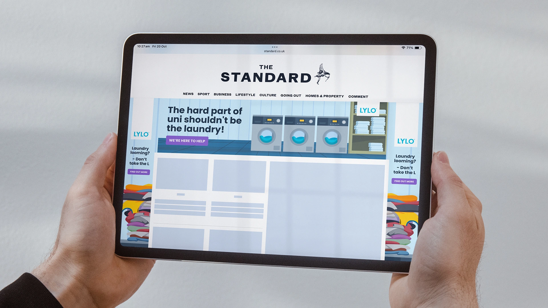
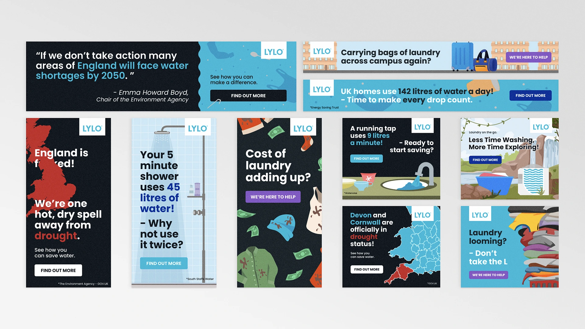
Marketing campaign and target demographic testing carried out with The Evening Standard. ROS and HPTO assets overdelivered with an average CTR of 0.25%.
A variety of assets were illustrated and designed
to fit standard web specifications. Coupled with audience-specific copy, these ads were intended
to elicit an emotional response from the site visitors.